
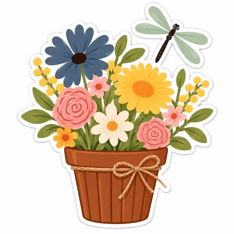
An invitation has one job: tell people what, when and where, and make them want to come. Clipart can help with the second part, but it is easy to bury the first. A few habits keep both working.
Choose the mood before the motifs
Decide whether the event is soft and pretty, bright and playful, or calm and simple, then pick a collection that matches. A garden party wants flowers and butterflies; a child’s birthday can take bolder color and a cheeky character or two. Choosing one collection rather than mixing three keeps colors and line weights consistent without any extra effort.
Use fewer, bigger pieces
One generous illustration placed with intention looks more expensive than a border of tiny ones. A good default for a 5×7 inch card is one main piece covering roughly a third of the card and one or two small accents that echo it.
Protect the words
- Keep artwork out of the area behind the date, time and address.
- Use a dark text color taken from the illustration rather than pure black. It looks deliberate and stays readable.
- Avoid placing pale yellow, mint or pink text on white; these colors are lovely in artwork and hard to read as letters.
Check the print size
Divide an illustration’s width in pixels by 300 to find how many inches wide it prints sharply. If your main piece needs to be 3 inches across, it should be at least 900 pixels wide. Each Caleigh Cooks recipe lists the image size of its actual files, so you can check before you buy.
Print a test
Screens glow and paper doesn’t. Print one copy on the paper you plan to use before ordering fifty. Colors usually come out a little darker, and that one test will show you whether the text needs to be bolder.
